MOBILE APP
2023

JUMEX
APP b2b

Designing a clear B2B ordering experience for retail partners

My Role

UI/UX Designer (UI-focused)

Plataform

iOS & Android
Scroll to case study
THE CHALLENGE

The Problem

Wholesale orders relied on manual and assisted processes.

Retail partners had limited visibility into the product catalog
Product availability was unclear or delayed
Communication between brand and retailers lacked efficiency

The Project Goal

Digitize the wholesale ordering process through a clear, fast and easy-to-use mobile app for retail partners.

My Role

UI/UX with a strong UI focus.

Definition of core user flows
High-fidelity interface design
Reusable component creation
Development-ready prototypes
Collaboration with product and engineering teams
THE solution

A mobile-first app designed for simplicity, clarity and speed, enabling retail partners to place orders independently and efficiently.

Key design focuses:

Clear category-based navigation
Simple and guided ordering flow
Interface designed for non-technical users
Scalable UI for future features
THE OUTCOME

A clear and consistent visual system focused on usability in real retail contexts, simplifying product discovery and ordering.

Results
& Impact

This redesign reduced friction in the ordering flow and improved clarity for retailers, enabling faster decisions and fewer errors.

01

Simplified flow

Reduced friction in the ordering process through clear navigation and guided steps.

02

Clear catalog

Improved product and category visibility to support faster decision-making.

03

User autonomy

Retail partners can place orders independently without relying on manual processes.

04

B2B scalability

A design system prepared to grow and support future digital sales features.

THE CONTEXT

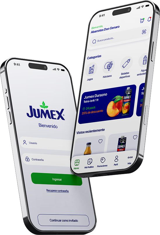
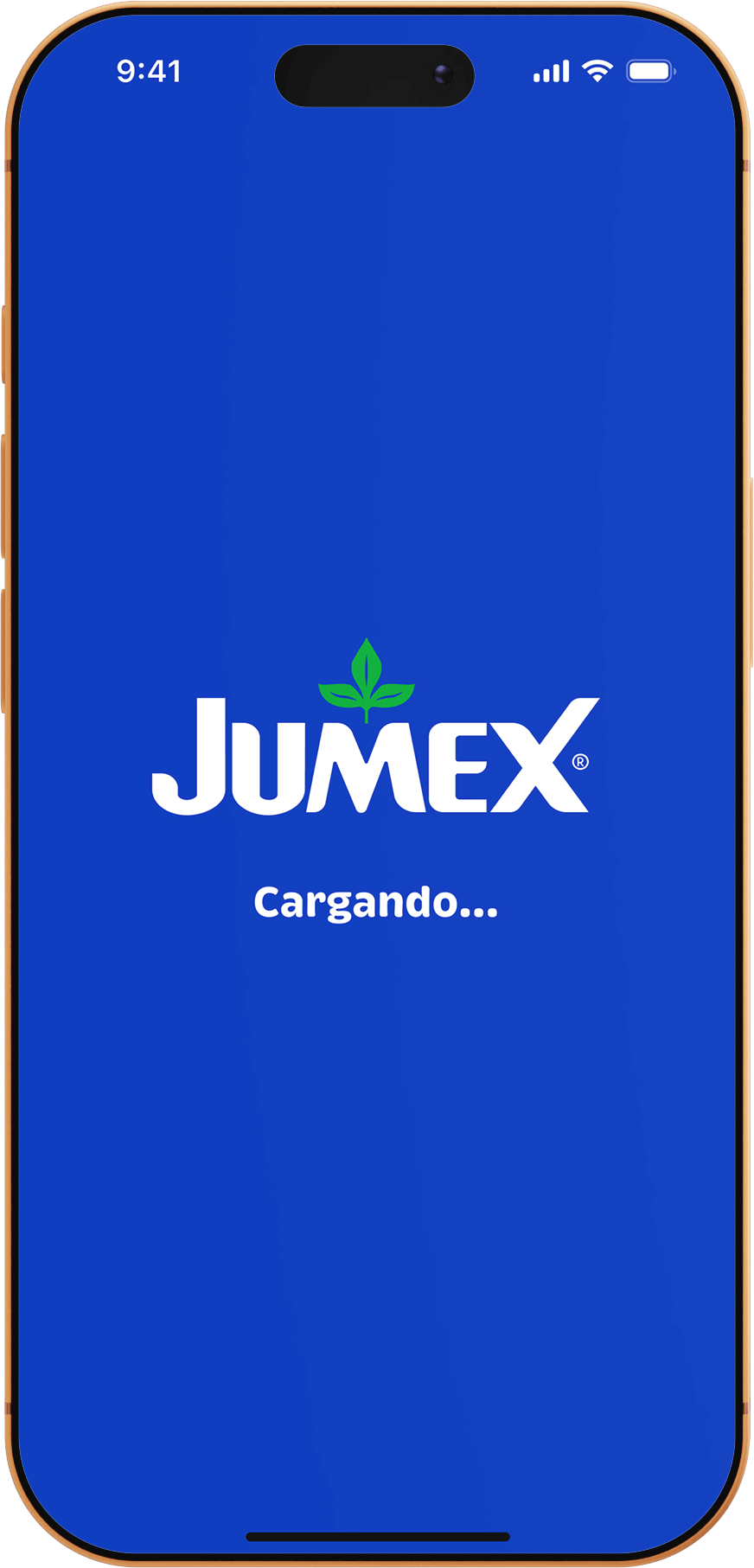
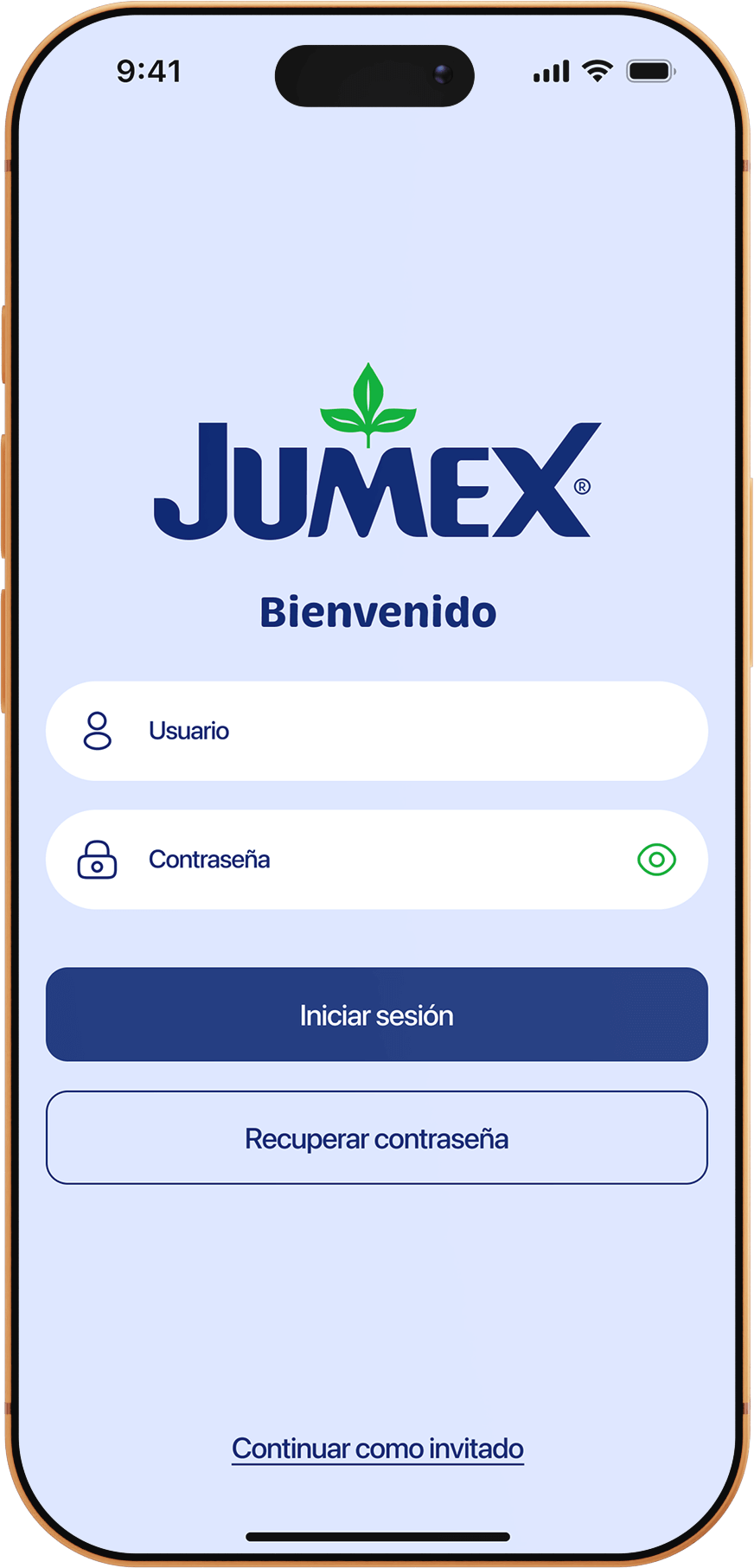
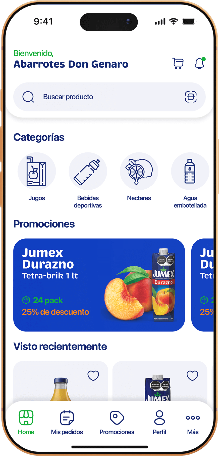
The project aimed to establish an initial B2B digital channel to improve the purchasing experience for retail partners and modernize the sales process.

Process

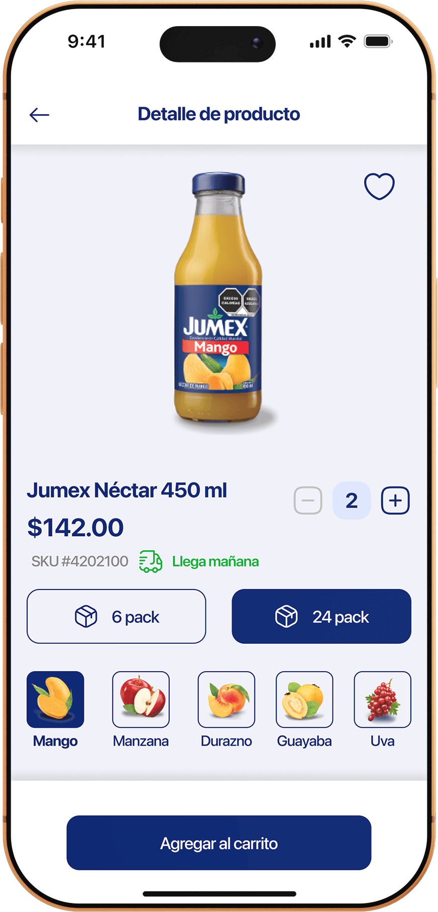
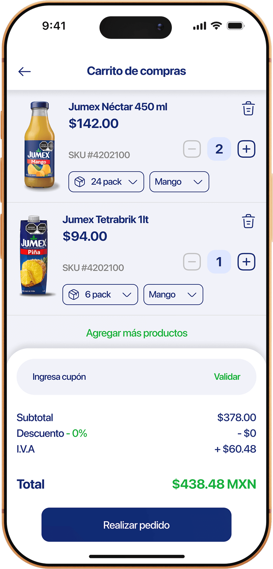
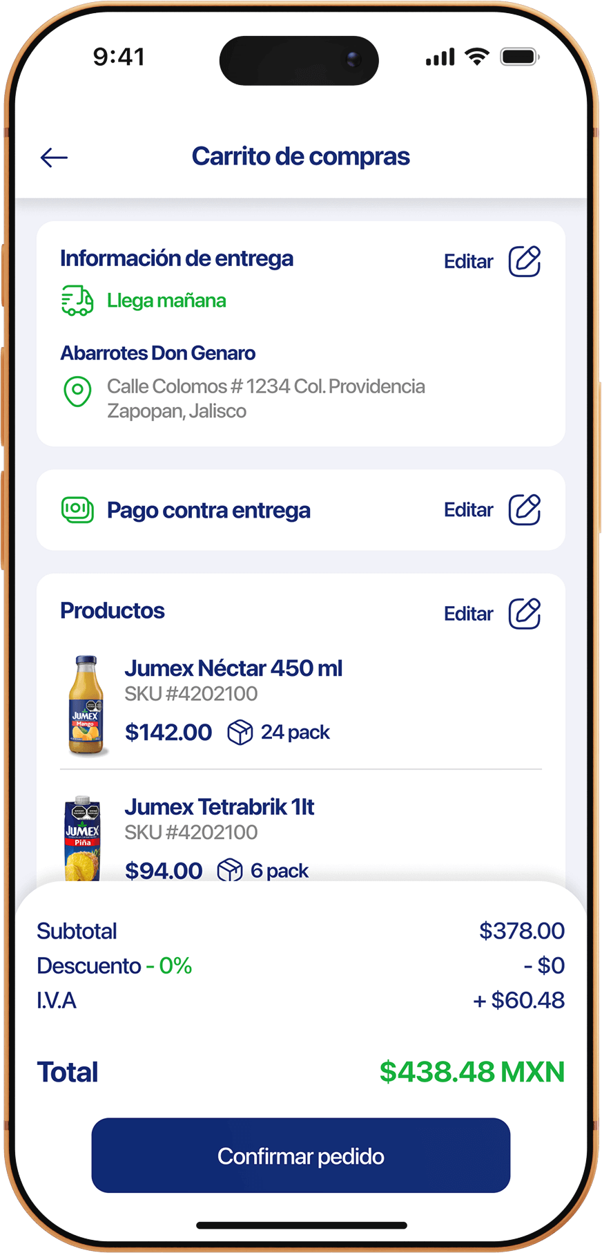
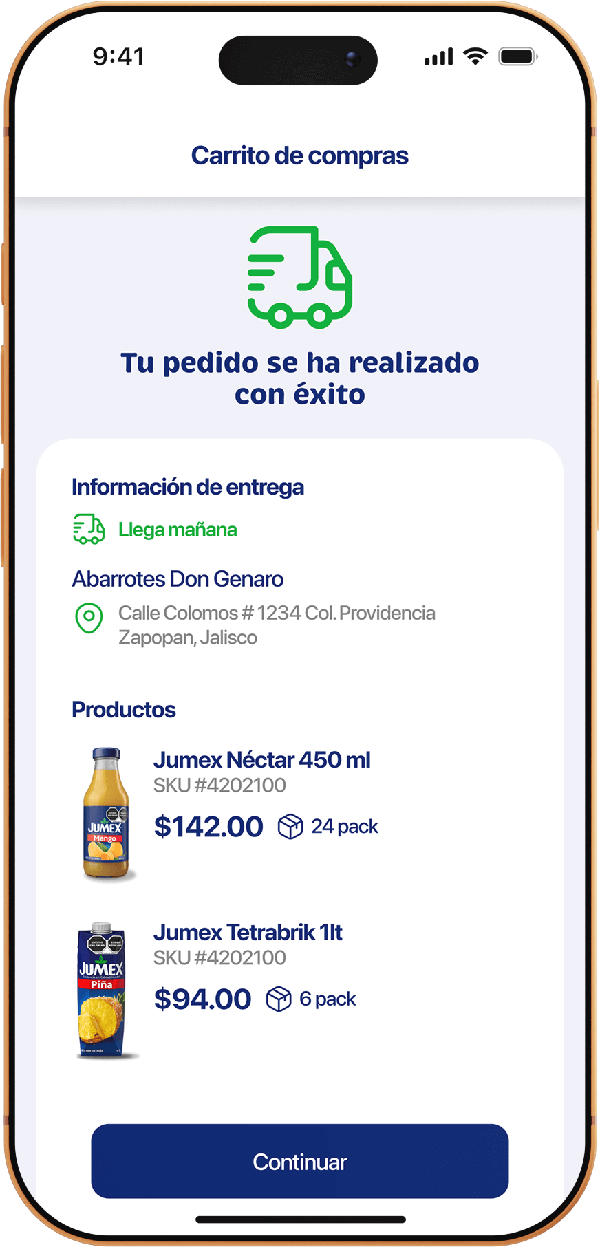
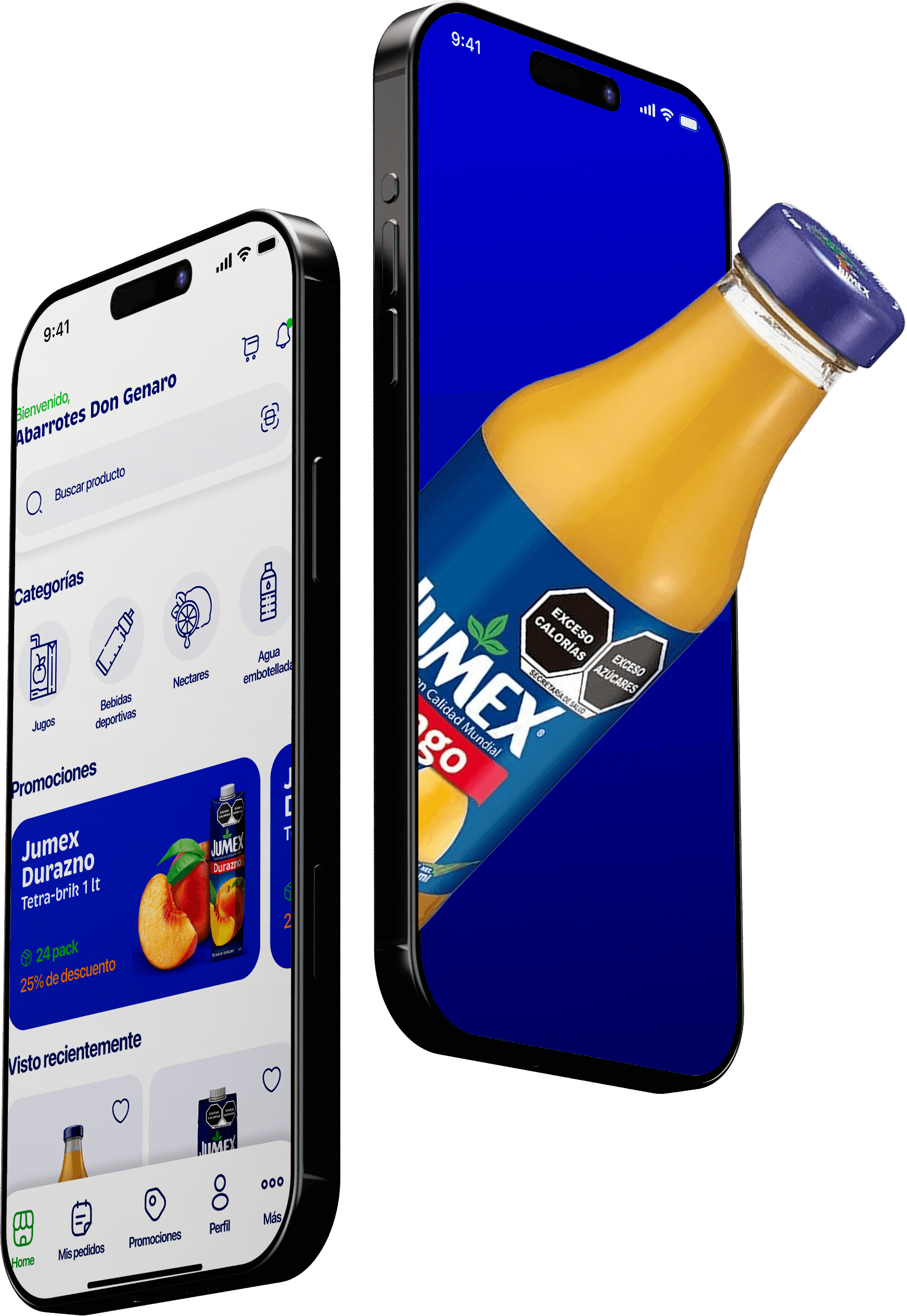
The process focused on understanding the existing sales flow and translating
it into a clear digital experience, prioritizing simplicity and usability.
Analysis of the existing
sales flow
Identification of
friction points
Definition of core
user flows
UI design focused on clarity and visual hierarchy

Design decisions

Design decisions were made with real-world usage in mind, aiming to
reduce complexity and support product adoption.

01

Speed
First
Prioritize speed over complexity

02

Flow Simplicity
Reduce unnecessary steps in the ordering flow

03

User Accessibility
Design for users with low digital familiarity

KEY Learnings

This project reinforced the importance of visual clarity and simplicity when designing B2B digital products.
“The best UI is the one you don't notice, but you see in the results.”

01

Visual Clarity
Visual clarity is critical in B2B products

02

UI Impact
Strong UI can reduce friction without complex flows.

03

Context Awareness
Designing for real-world contexts
improves adoption

Ready to explore more?

Click to see other case studies.