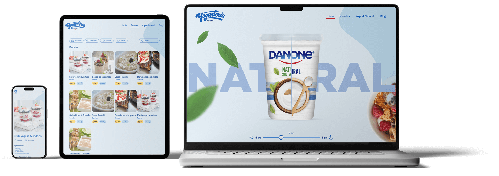
The project was developed as a digital experience aimed at inspiring everyday yogurt consumption by integrating editorial content and recipes within a clear, accessible interface.
Process
The process focused on structuring visual and functional content clearly,
prioritizing fast exploration and information hierarchy.
prioritizing fast exploration and information hierarchy.
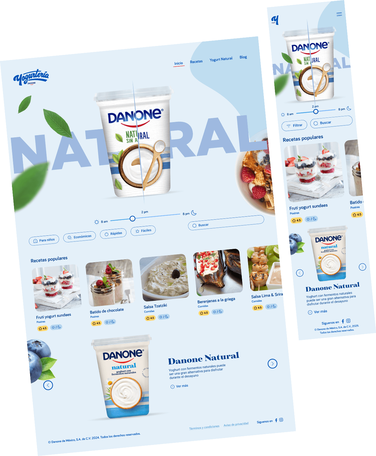
Visual content as the core experience
Card-based recipe exploration
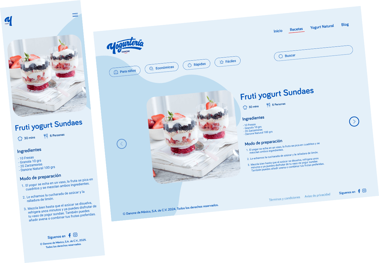
Clear and scannable recipe detail views
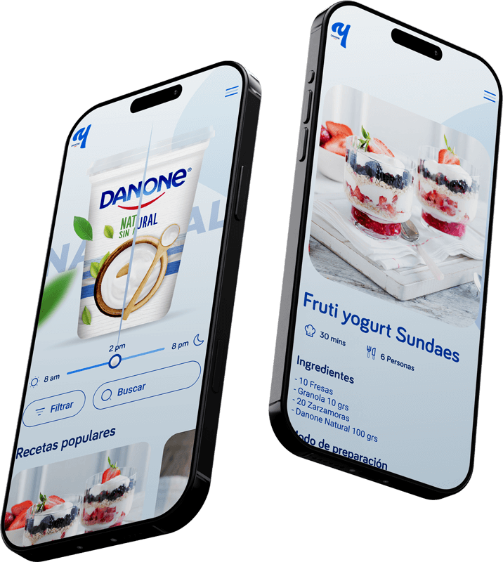
Mobile-first experience adapted to desktop
Design decisions
Design decisions prioritized visual clarity, content hierarchy, and intuitive
navigation to support effortless recipe exploration.
navigation to support effortless recipe exploration.
01
Content
First
First
Visual content drives the entire experience.
02
Card
Navigation
Navigation
Recipes are presented in cards to support discovery.
03
Cross-Plataform
The experience was designed mobile-first and carefully adapted to desktop.